Kish Computers
Redefining a decade-old IT services company with a modern, confident identity that builds trust and sets it apart in a competitive market.
Branding
Tech
Overview
Kish Computers is a long-standing IT and services company that specializes in tech products, device repairs, and B2B corporate solutions.
Having operated for over a decade, the brand had earned recognition in the market, but its outdated and unprofessional branding was holding it back.
The lack of a strong identity made Kish Computers appear untrustworthy and insecure, which meant they were losing opportunities in the competitive B2B sector.
The leadership team realized that to win contracts and scale, they needed a complete brand transformation—one that would align their identity with their expertise and give them the confidence to approach clients at every level.

Branding & Creative Design
The first step in redefining Kish Computers was to research the competitive landscape
What we discovered was clear: most competitors fell into two extremes—either too corporate and cold, or too bland and forgettable. This presented a unique opportunity to position Kish Computers as a bold, youthful, and professional alternative.
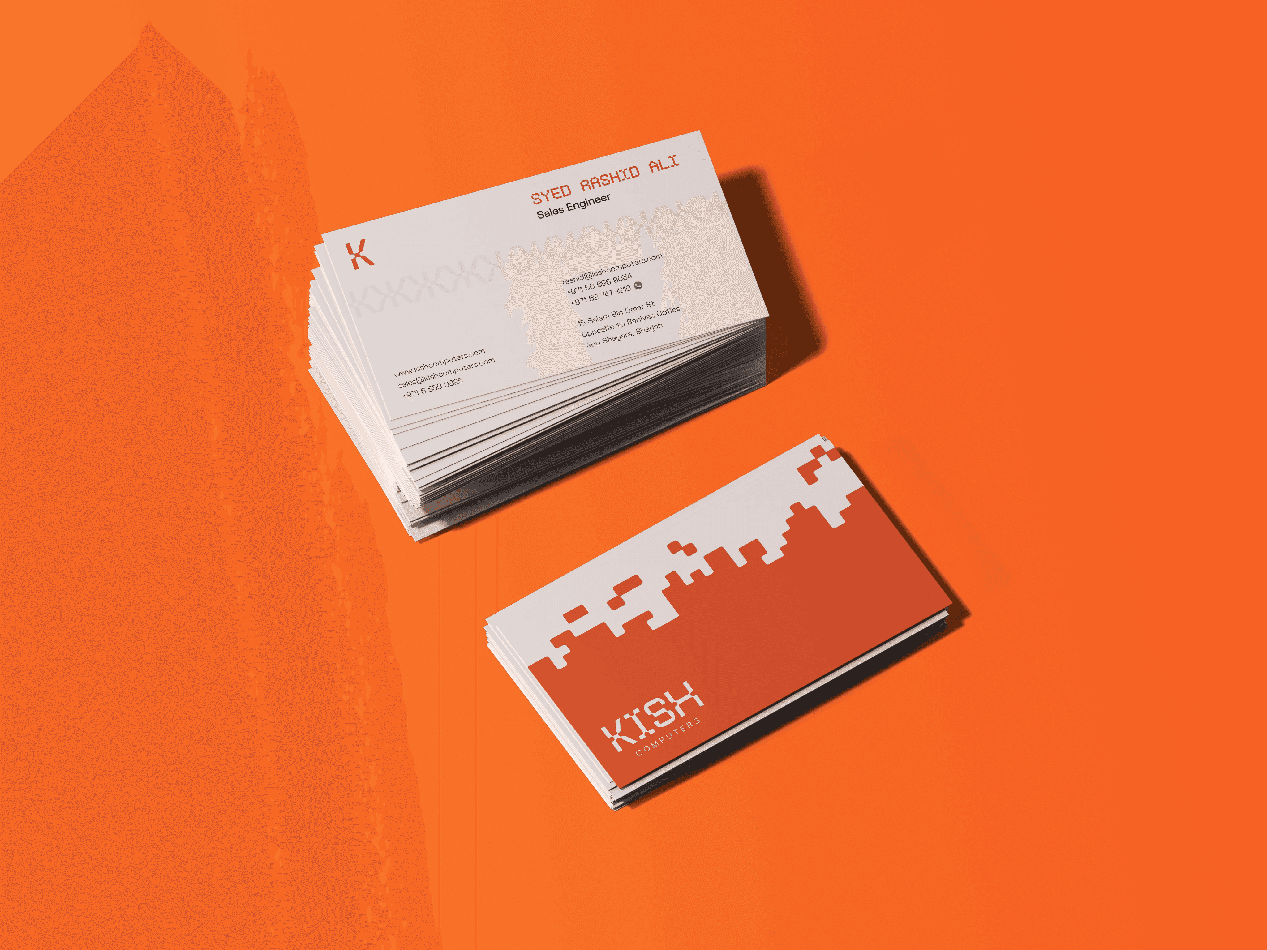
We began by revisiting the company’s logo. While the old design had several issues, it had also built valuable brand equity over time. To preserve this equity, we looked at elements worth carrying forward. After multiple consultations with the client, we decided to keep the signature orange color as a nod to their legacy.
From there, we built a completely new identity around a typography-based logo. After several rounds of creative exploration, we landed on a design that was classy, bold, and unmistakably modern. The typography gave the brand strength and authority, while the vibrant orange injected energy and youthfulness—striking the perfect balance between professionalism and approachability.
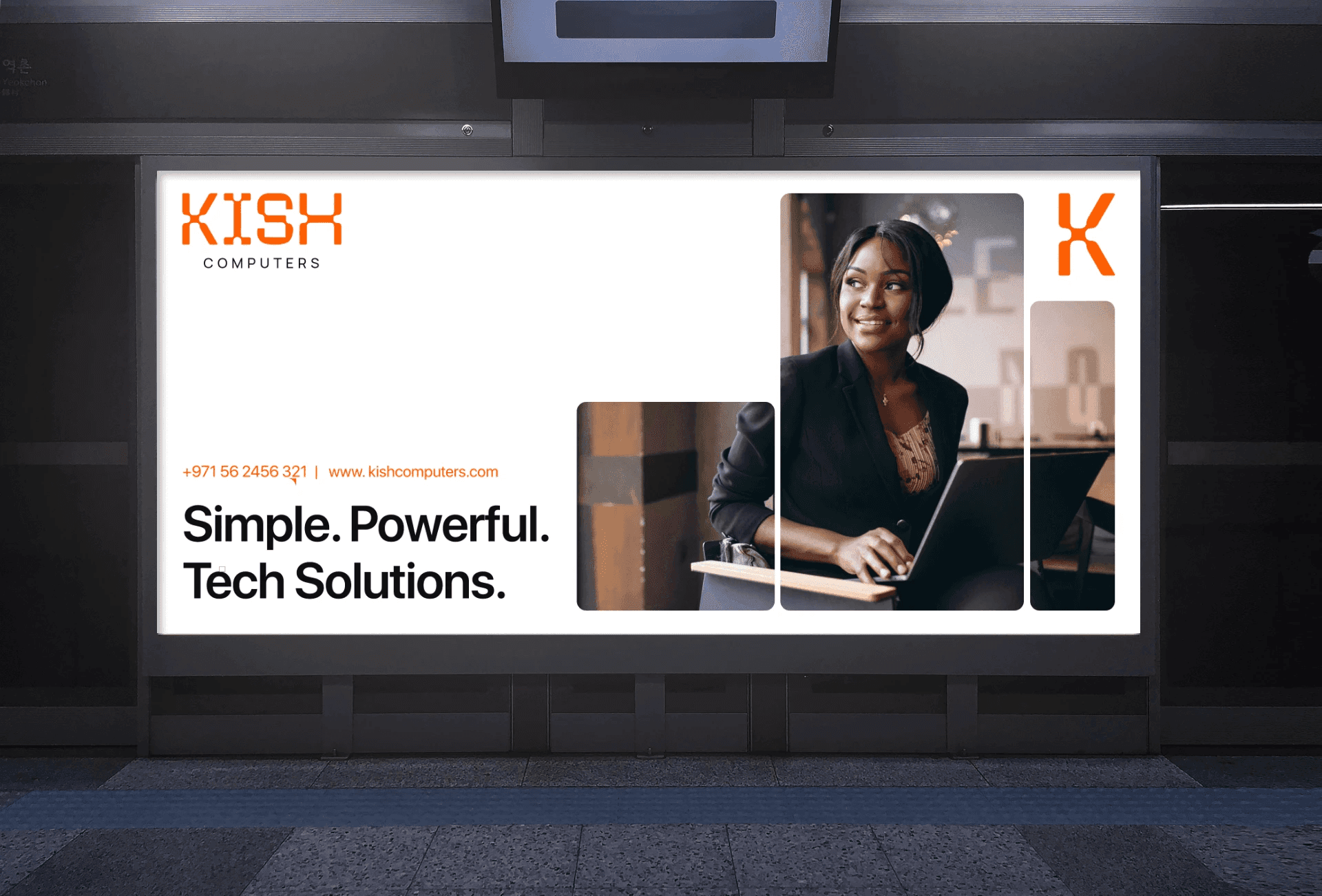
With the logo finalized, we expanded the visual identity into a full branding system. The new look featured strong contrasts, bold color applications, and consistent design elements that could be applied across all touchpoints, from stationery to digital assets.


Results
The transformation of Kish Computers was more than a design upgrade—it was a shift in perception.
The new branding repositioned the company from insecure to confident, from untrustworthy to credible, and from outdated to professional.
Armed with a fresh identity, Kish Computers could now:
Approach B2B clients with renewed confidence.
Stand out in a crowded IT and services market.
Build long-term trust through a consistent and professional visual identity.
The bold rebrand gave Kish Computers the tools to communicate its strengths clearly and helped reposition the company as a forward-thinking IT solutions provider ready for the next decade of growth.

More Work


Ready to Actually See Results?
Kish Computers
Redefining a decade-old IT services company with a modern, confident identity that builds trust and sets it apart in a competitive market.
Branding
Tech
Overview
Kish Computers is a long-standing IT and services company that specializes in tech products, device repairs, and B2B corporate solutions.
Having operated for over a decade, the brand had earned recognition in the market, but its outdated and unprofessional branding was holding it back.
The lack of a strong identity made Kish Computers appear untrustworthy and insecure, which meant they were losing opportunities in the competitive B2B sector.
The leadership team realized that to win contracts and scale, they needed a complete brand transformation—one that would align their identity with their expertise and give them the confidence to approach clients at every level.
Branding & Creative Design
The first step in redefining Kish Computers was to research the competitive landscape
What we discovered was clear: most competitors fell into two extremes—either too corporate and cold, or too bland and forgettable. This presented a unique opportunity to position Kish Computers as a bold, youthful, and professional alternative.
We began by revisiting the company’s logo. While the old design had several issues, it had also built valuable brand equity over time. To preserve this equity, we looked at elements worth carrying forward. After multiple consultations with the client, we decided to keep the signature orange color as a nod to their legacy.
From there, we built a completely new identity around a typography-based logo. After several rounds of creative exploration, we landed on a design that was classy, bold, and unmistakably modern. The typography gave the brand strength and authority, while the vibrant orange injected energy and youthfulness—striking the perfect balance between professionalism and approachability.
With the logo finalized, we expanded the visual identity into a full branding system. The new look featured strong contrasts, bold color applications, and consistent design elements that could be applied across all touchpoints, from stationery to digital assets.
Results
The transformation of Kish Computers was more than a design upgrade—it was a shift in perception.
The new branding repositioned the company from insecure to confident, from untrustworthy to credible, and from outdated to professional.
Armed with a fresh identity, Kish Computers could now:
Approach B2B clients with renewed confidence.
Stand out in a crowded IT and services market.
Build long-term trust through a consistent and professional visual identity.
The bold rebrand gave Kish Computers the tools to communicate its strengths clearly and helped reposition the company as a forward-thinking IT solutions provider ready for the next decade of growth.
More Work